Range Rover’s Fresh Logo Comes with a Stylish Twist
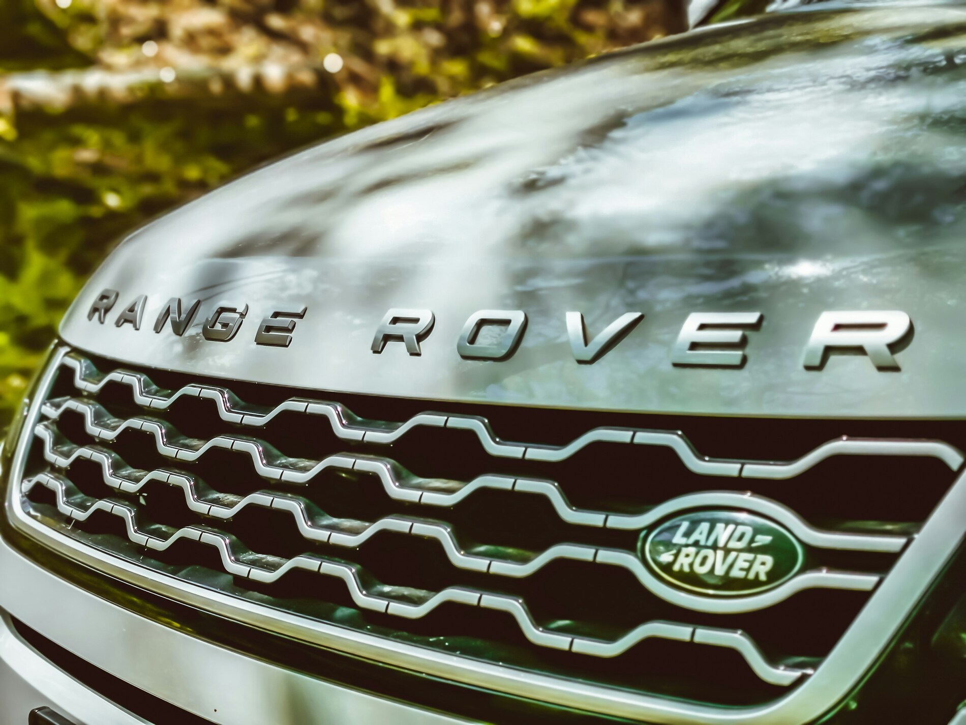
Relax, the classic Range Rover badge isn’t going anywhere. This one’s just for the details.
- JLR (formerly Jaguar Land Rover) has introduced a cool new logo for Range Rover to give the brand its own identity under JLR’s new House of Brands plan.
- The new logo displays a unique design with mirrored Rs, along with the latest checker pattern created from those Rs in a repeated, interlocking design.
- Don’t worry, as this new symbol won’t replace the script Range Rover badge; it’s merely a smaller emblem for spots where the full name doesn’t fit well.
JLR (formerly Jaguar Land Rover) has introduced a cool new logo for Range Rover. The move came because of the new House of Brands strategy of JLR. According to that strategy, each of the four main brands (Range Rover, Defender, Jaguar, and Discovery) will have a unique and separate identity. Autocar reported that the new logo was spotted in the latest JLR investor presentation.
The new logo reveals stacked and mirrored Rs using the typical script of the brand. Jaguar has already disclosed its own set of minimalist logos using both uppercase and lowercase letters. Nevertheless, as for Defender and Discovery, their brand redesigns haven’t been made public yet.
Alongside the emblem, the brand also disclosed the ‘Range Rover Pattern.’ This is a latest checker-like design created from those Rs in a repeated, interlocking design. This design is not yet clear how the automaker will employ the new pattern. However, we wouldn’t be amazed to see it in the upcoming front ends of Range Rover.
Don’t worry, as this new symbol won’t replace the script Range Rover badge. It’s merely a smaller emblem for spots where the full name doesn’t fit well. “The Range Rover Motif has been developed as a smaller symbol for where our familiar Range Rover device mark does not fit, such as on a label or as part of a repeating pattern, and within event spaces where an emblem is more appropriate,” a spokesperson of JLR clarified.